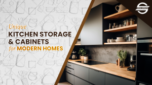
Table of Contents
The kitchen is a mirror of the human condition. It reflects how we want to nourish and be nourished, physically as well as emotionally. Its atmosphere isn’t shaped by layout alone, it’s shaped by color. And a colorless kitchen might signal a yearning for clarity or control. The colors we surround ourselves with leave an impact on our behaviours and health as well.
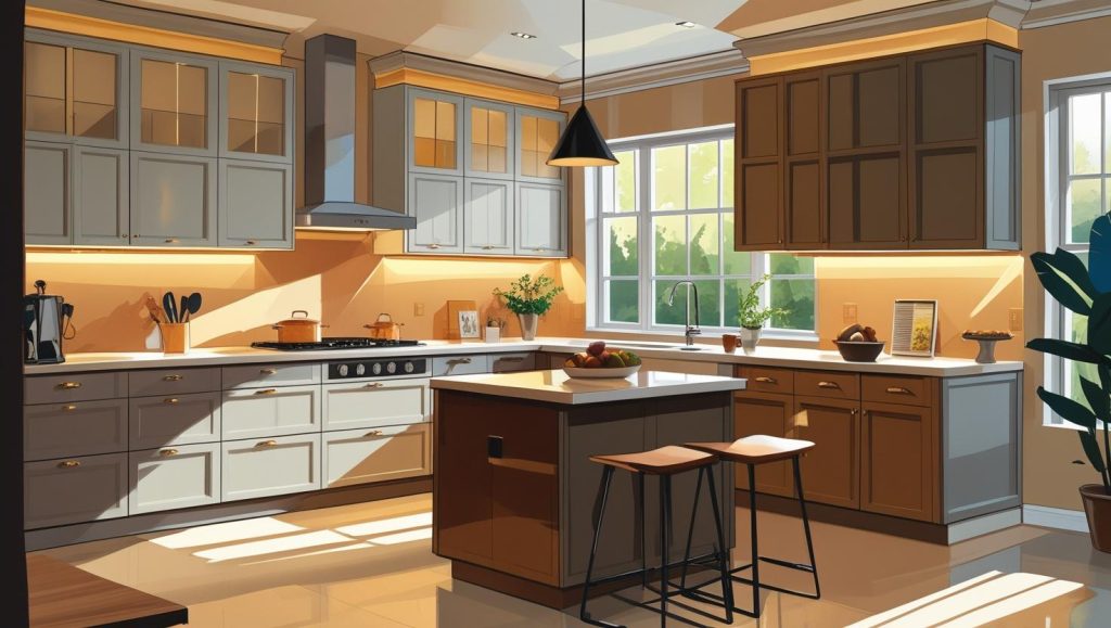
When selecting the right color scheme for your kitchen interior, it’s essential to consider three key elements, the size of the space, the availability of natural light, and the overall design style you’re aiming to achieve. For smaller kitchens, lighter shades, such as soft whites, pale greys, or muted creams, are excellent choices. These hues reflect natural light effectively which makes compact areas feel brighter and more open. In contrast, larger kitchens can handle richer, deeper tones like navy blue, charcoal, or forest green which lead to a sense of depth, elegance, and warmth without overwhelming the space.
You should also complement the other elements, flooring, countertops, cabinetry, so the whole space feels pulled together. If you prefer a monochrome palette or a more contrasting mix, the key is balance. Even something as simple as a two-tone kitchen cabinet color scheme, one color for the uppers, another for the lowers, can add character and a modern touch without overwhelming the space.
Why Two-Tone Kitchen Color Scheme?
The two-tone kitchen interiors is a strategic design approach that:
- enhances spatial perception
- encourages customization
- improves functionality
- creates attractive focal points
- strikes a balance between trendy flair and timeless appeal
- leverages psychological color dynamics to shape how you feel in the space
How to Incorporate Two-Tone Kitchen Cabinet Color Schemes?
1. What’s your strategy?
- You should choose a clear focal area for contrast, like the island or lower cabinets, so the two-tone effect feels deliberate rather than decorative.
- You should use lighter shades on upper cabinets to keep the space feeling open, and darker tones below to create a structured base.
- Maintain proportion between the two tones, ideally a 70/30 or 60/40 split, to avoid visual imbalance or competing elements.
- You need to echo your accent color subtly through smaller details like bar stools, backsplashes, or cabinet hardware to tie the whole palette together with sophistication.
2. Peaceful Colors for Your Kitchen Interiors
- Color blues and greens offer a calming, serene atmosphere. It makes kitchen designs feel more tranquil. Light blue hues evoke open skies and lower stress, while sage and earthy greens connect to nature and promote clarity.
- Neutral tones, soft whites, greys, and beiges, are responsible for creating a timeless, clean backdrop. They reflect light and foster spaciousness, especially when paired with natural wood or stone for added warmth.
- Earth tones like muted browns, taupes, and terracottas add a rooted, comforting presence. These hues provide emotional stability and balance the cooler palette when used as lower cabinet tones.
- You can combine calm colors strategically since they can make two-tone designs feel intentional and meditative, for instance, a pale blue upper matched with a subdued olive-green lower, or light grey paired with a warm earth tone. It gives both visual harmony and emotional balance.
3. Balance and Proportion
- You should aim for a 60/40 to 70/30 split between your primary and accent tones, for example, 60% neutral base and 40% accent on island or lower, to maintain visual harmony.
- You should favour lighter shades on upper cabinets and darker tones below to avoid visual heaviness and to subtly frame the space.
- If you choose to use complementary or tonal shades like a deeper and lighter hue within the same color family, you can achieve a cohesive, balanced aesthetic without clashing.
- You must ensure the two tones are echoed in other design elements, backsplash, hardware, flooring, for a unified look that feels thoughtfully composed.
4. Leverage Light and Your Kitchen Interior Layout
- If you place darker tones where they’ll be well-lit, such as under natural light from windows or skylights, to prevent them from appearing flat or heavy, and use lighter-tone uppers in less lit areas to keep the eye drawn upward.
- It is wise to use layer lighting with recessed ambient lights, under-cabinet LEDs, and pendant/task fixtures over islands or prep zones. This multi-level illumination highlights kitchen color contrast with both functionality and depth.
- It’s better to use under-cabinet lighting to emphasize the break between two tones and elevate countertop visibility. You can select LED strips with your color temperatures that complement your kitchen cabinet color schemes (cool whites for grey/white schemes, warmer tones for earthy hues).
- The way to configure your layout is to go by natural light patterns, position your primary work zones and two-tone focal points, such as kitchen island or coffee bar, where light is strongest. You should reserve darker cabinets for shadowed walls or lower zones to preserve brightness.
5. Coordinate Hardware and Surfaces
- You must go for consistent hardware finishes, like brass on dark tones and stainless or matte black on lighter tones, to unify your two-tone layout and add intentional contrast.
- Let countertops and backsplashes bridge both kitchen cabinets’ hues, for instance, marble with grey veining works beautifully between white uppers and charcoal lowers. It creates smooth visual flow.
- If you wish to incorporate material and texture harmony, you should pair glossy upper cabinets with matte lower ones, or juxtapose painted surfaces with natural wood for visual richness.
- To avoid visual clutter or clashing finishes, echo accent tones elsewhere, such as, cabinet hardware, faucet finish, lighting fixtures, or even stool frames, so the contrast feels thoughtfully integrated.
6. Customized Style and Longevity

- ou should go for a neutral base (white, cream, grey, or natural wood) paired with a bolder yet complementary accent tone to keep your kitchen colors looking fresh over time.
- It’s recommended to choose durable finishes (semi-gloss or satin paint on high-use areas like lower kitchen cabinets) to resist wear and make cleaning easier. This maintains the look longer.
- Try to invest in quality cabinetry construction, such as solid wood or plywood, which endures far beyond inexpensive alternatives and adds value to your space.
- You should build in long-term flexibility by using accent color on movable or repaintable elements like islands or accessory zones, so if trends shift, a simple refresh rather than full remodel keeps your design current.
- Coordinate hardware choices (eg, brass, matte black) that transcend fleeting trends, they’re easy to swap and can anchor your design’s enduring aesthetic.
- One thing is for sure that you must avoid overly trendy combinations, stick to timeless pairings like wood plus white or navy plus grey to guarantee broader appeal when reselling or updating in the future.
Two-Tone Color Schemes for Your Kitchen Interiors
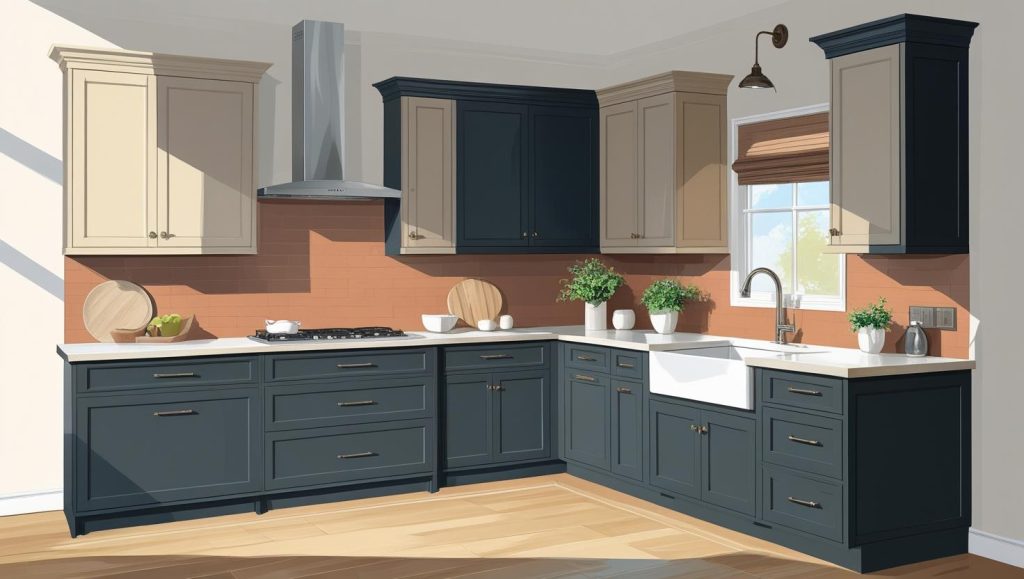
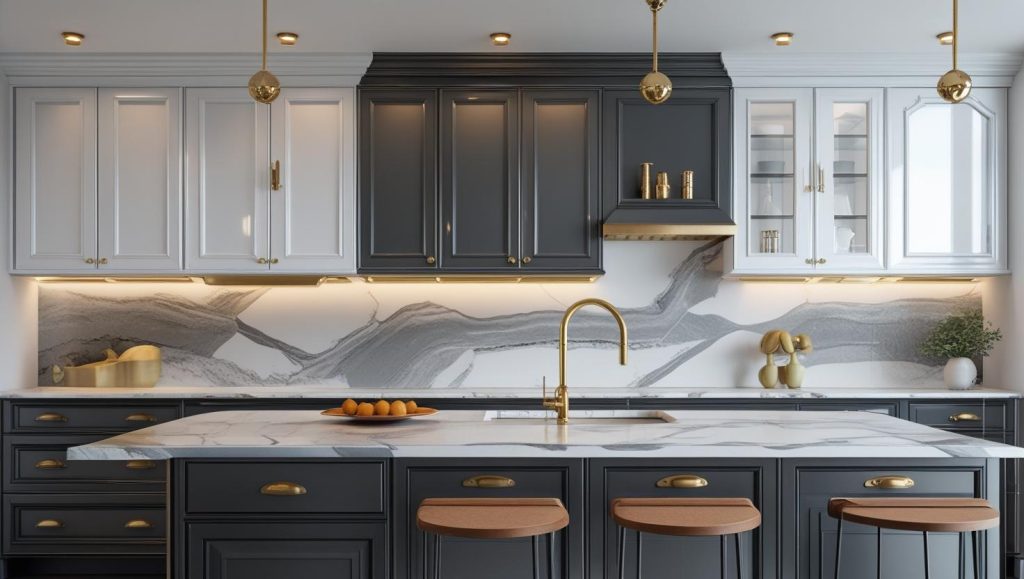
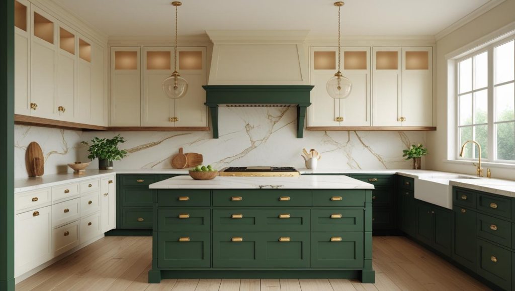
1. Satin White and Dark Grey/Charcoal Color Scheme
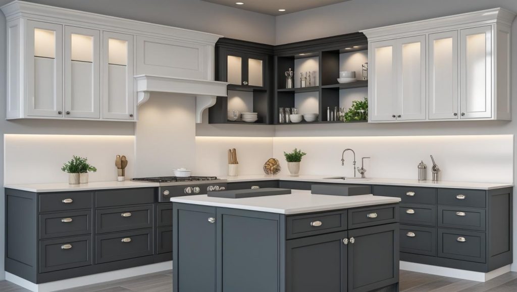
- It is suggested to pair white upper cabinets with dark grey or charcoal lowers to create height, depth and visual structure.
- The contrast brings open brightness atop and grounded solidity below. This gives a more generous feel to compact kitchens too.
- You should choose finishes deliberately, matte grey below resist scratches, while glossy or satin white above reflects light and increases cleanliness.
- You can integrate open shelving or glass-front uppers to break up darkness and maintain an airy aura above charcoal tones.
- It is smart to employ consistent hardware and surface coordination. Brushed metal, brass or matte black goes well with both tones.
- Anchor the design with a standout accent island in charcoal, with surrounding white kitchen cabinets to emphasize focal depth.
- This palette gels evergreen grace with modern adaptability. Its neutral base makes future tweaks easy, while avoiding overly trendy pitfalls.
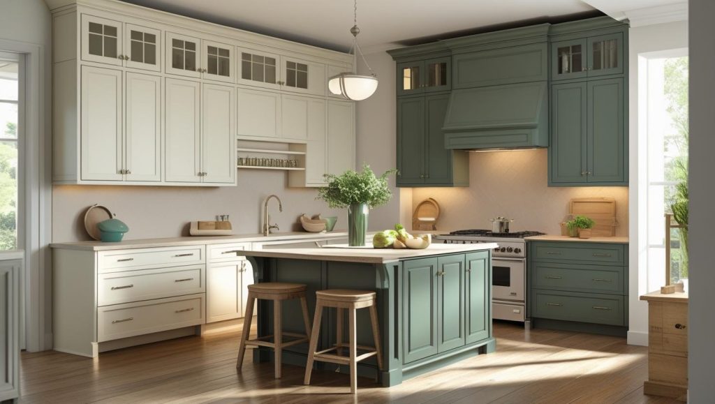
2. Forest Green and Off-White /Cream Kitchen Color Scheme
- A pairing of forest green on lower cabinets with off-white or cream uppers accounts for depth and warmth while keeping the upper space light and airy.
- Forest green brings a biophilic, grounding presence, evoking nature and offering a calming, stable environment in the kitchen.
- Brass or gold handles go really well with forest green. They add a nice warm glow and make the whole look feel a bit more luxurious.
- You should use white or cream countertops and backsplashes, such as marble with soft veining, to balance the darker lower tones and maintain a fresh, cohesive look.
- If you incorporate natural wood elements, open shelving, flooring, or incomplete countertops for added texture and organic contrast.
- Make sure that you deploy abundant lighting, especially natural light, alongside under-cabinet or pendant fixtures to prevent heavy greens from feeling too sombre.
- If a full lower-cabinet application feels too intense, you should consider using forest green just on your kitchen island or backsplash.
- This two-tone kitchen color scheme brings together lifetime contemporary boldness that allows flexibility in decor and finishes over time.
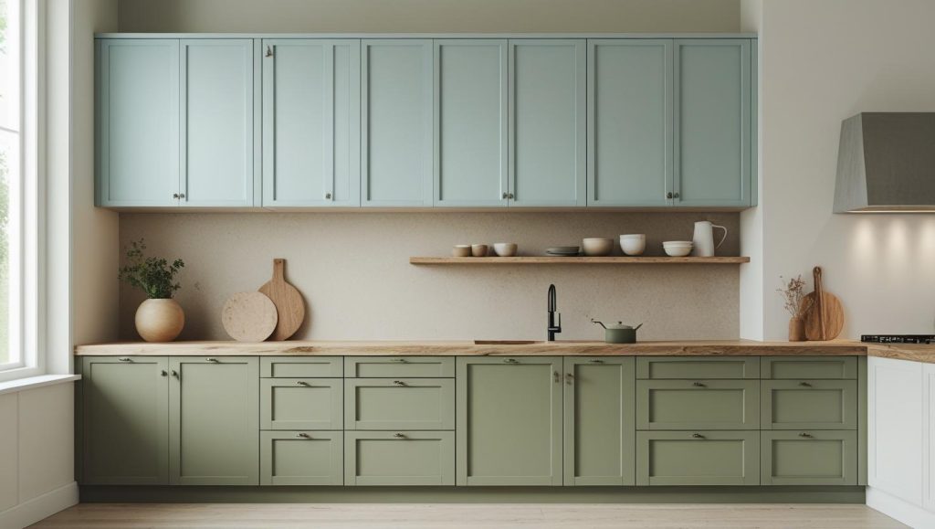
3. Sage/ Olive Green and Natural Wood Color Scheme
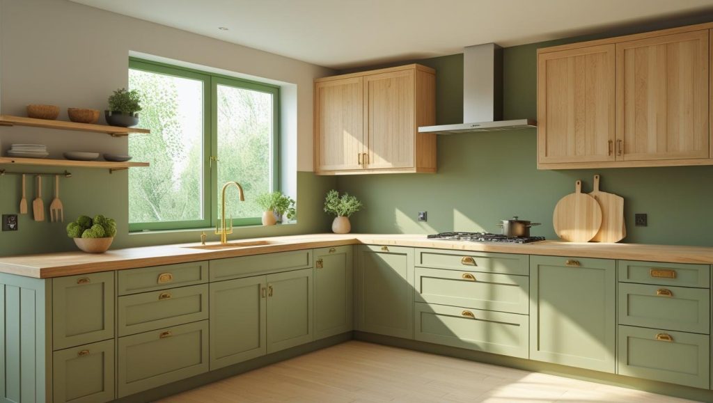
- Sage or olive green has this calm, grounded effect that is perfect if you want your kitchen interiors to feel relaxed but still fancy.
- Natural wood brings in warmth and texture that softens the green, so the space doesn’t feel too cold or flat.
- This combo works really well in kitchens that get a lot of natural light. The green doesn’t overpower, and the wood glows beautifully.
- If you’re not ready to go all in, try keeping your lower cabinets in sage or olive and let the upper section shine in a light wood like ash or oak.
- You can mix in brass or matte black handles to either warm things up or give the kitchen a sharper, modern edge.
- Open wooden shelves, potted herbs, or even wooden bar stools help tie the whole look together.
- This pairing suits a lot of styles: farmhouse, Japandi, even modern minimal. It depends on how you accessorize.
- The best part is that it doesn’t feel like a trend you’ll grow tired of. Both colors age well and hold up even when you change decor around them.
4. Two-Tone Wood Color Scheme for Your Kitchen
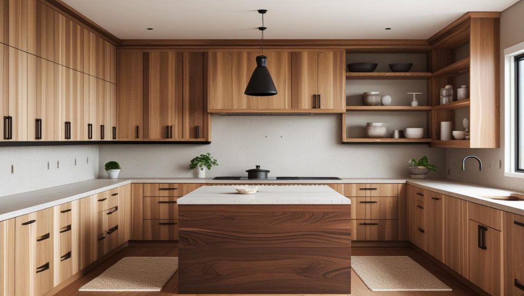
- You can mix a light wood like ash or maple with a darker one like walnut for instant depth.
- You might want to keep the upper cabinets lighter. It’ll make the kitchen interiors more open.
- You could anchor the space with darker base cabinets or a bold wood-tone island.
- You’ll notice how repeating one wood tone in open shelves or trim pulls the look together.
- You don’t have to match everything, just make sure the grains and undertones feel related.
- You should keep your kitchen countertops and backsplash subtle so the wood stands out.
- You may like using matte black or brushed brass handles. They both work beautifully with mixed wood tones.
- You’ll need good lighting, especially under-cabinet, to bring out the grain and avoid a heavy feel.
- You can even play with texture. Try mixing smooth finishes with rawer, more natural ones.
- You’re not locked into one style. This look works across modern, rustic, and everything in between.
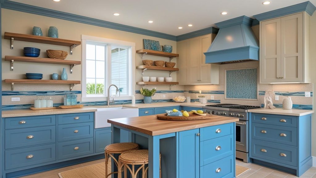
5. Navy Blue and White Color Scheme
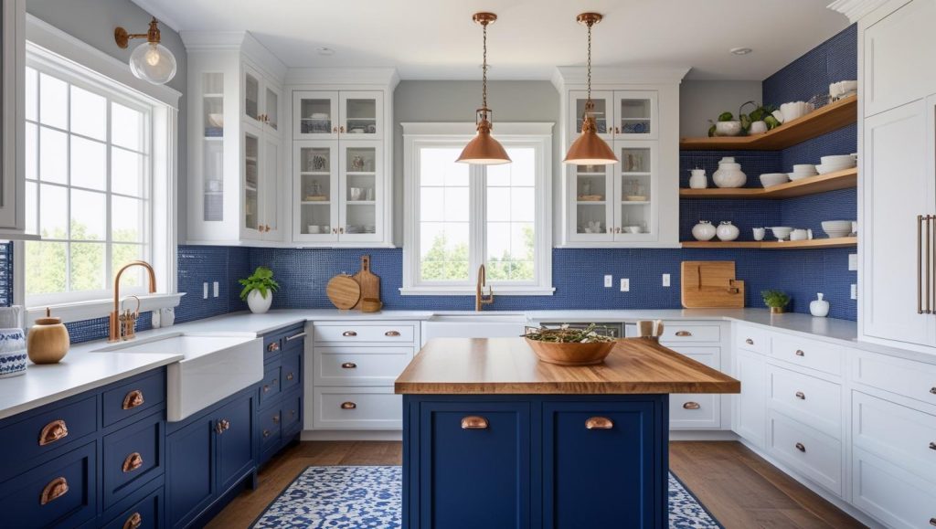
- You might use navy for your lower kitchen cabinets and crisp white for the uppers that way, the white keeps things fresh, and the navy grounds the room.
- If you’re worried about too much darkness, you can think about placing navy under windows or near open shelving so natural light softens the look.
- You could let navy be the star of your kitchen island instead, keeping surrounding cabinetry white it adds elements without overpowering the space.
- You’ll find the navy behaves almost like a neutral. It pairs beautifully with whites, greys, or woods, meaning you’re free to mix in other materials later.
- You can personify your kitchen interiors with patterned backsplashes. Navy subway tiles or blue-white mosaics bring texture and charm.
- You’ll want some warmth as in, a homier feeling, so think of introducing wood tones like butcher block islands, shelving, or trim to soften the look.
- You should pick hardware that complements both tones, brass or copper warms things up, while matte black keeps it modern.
- You’ll definitely need layered lighting, pendants, under-cabinet LEDs, to make sure the navy doesn’t swallow the space.
- If the navy feels a bit much, you could paint just the lower cabinets or the island, and keep the rest white. It’s easy to experiment that way.
- You’ll love how this two-tone kitchen color combo brings a crisp edge. You can go for coastal cool or modern farmhouse, depending on your accents.
6. Charcoal and Mustard Yellow Color Scheme
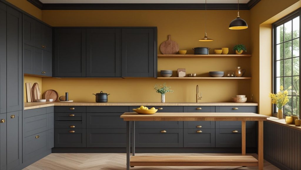
- You might be drawn to charcoal for its depth, but once you place it alongside mustard yellow, you’ll notice the whole space begins to feel more engaging, more defined.
- When you’re working with mustard, even in its muted form, restraint matters. You can use it on select upper cabinets, a breakfast bar, or a feature wall to bring focus without taking over.
- You don’t have to go bright. Mustard works best when it leans earthy, something softer, warmer, and grounded. That’s what lets it hold its own against charcoal’s cool, weighty character.
- Be mindful of the finishes while you plan. Matte charcoal looks timeless, while a soft sheen on mustard can lift the tone gently, with no screaming for attention.
- You’ll find that wooden touches, be it a butcher block top or warm oak shelves, help both colors settle into a more lived-in, familiar feel. They cut the contrast without dulling it.
- Does your kitchen get a lot of natural light? If it does, that’ll help mustard look brighter and more cheerful. If not, under-cabinet lights or warm pendants can help keep the kitchen color palette from feeling too heavy.
- You can subtly tie both shades together with the right hardware. Brass or brushed gold handles quietly echo the warmth in mustard and add softness to charcoal.
- Try not to overthink symmetry here. Mustard doesn’t have to be perfectly balanced across both sides. Sometimes, just one accent section is enough to shift the feel of the whole room.
- If you’re still unsure about going all in, experiment with accessories first. A mustard backsplash tile, bar stools, or even crockery in open shelving can give you a sense of liveliness of this palette.
- What matters most is how the combination makes you feel when you walk into the space, grounded by the calm, lifted by the light. You’ll know when it feels right.
7. Terracotta and Linen White Color Scheme
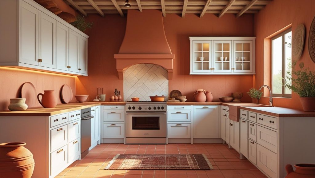
- You can keep most kitchen cabinets in linen white and introduce terracotta on a feature wall or island to anchor the space without overwhelming it.
- You’ll want to pair terracotta with white that has a warm undertone, nothing too stark, so the contrast feels soft and inviting rather than jarring.
- You should balance the palette with natural stone or wood countertops. They help blend the terracotta and white into a cohesive, earthy whole.
- You might frame open shelving or accents in wood to subtly echo both terracotta tones and white cabinetry.
- You’ll see terracotta tiles, floor or backsplash, delivering depth and texture that makes the white feel fresh but grounded.
- You’ll appreciate how golden-hour or warm-toned lighting enhances the terracotta. It makes it glow and feel more integrated with the white surfaces.
- You could start with terracotta accents, maybe pots, a rug, or kitchenware, before committing to cabinet paint, so you feel it out first.
- You’ll notice the combination lean Mediterranean or farmhouse, which gels up clean brightness with clay-earth depth in a way that feels both nostalgic and current.
8. Dusty Rose and Light Wood Color Scheme
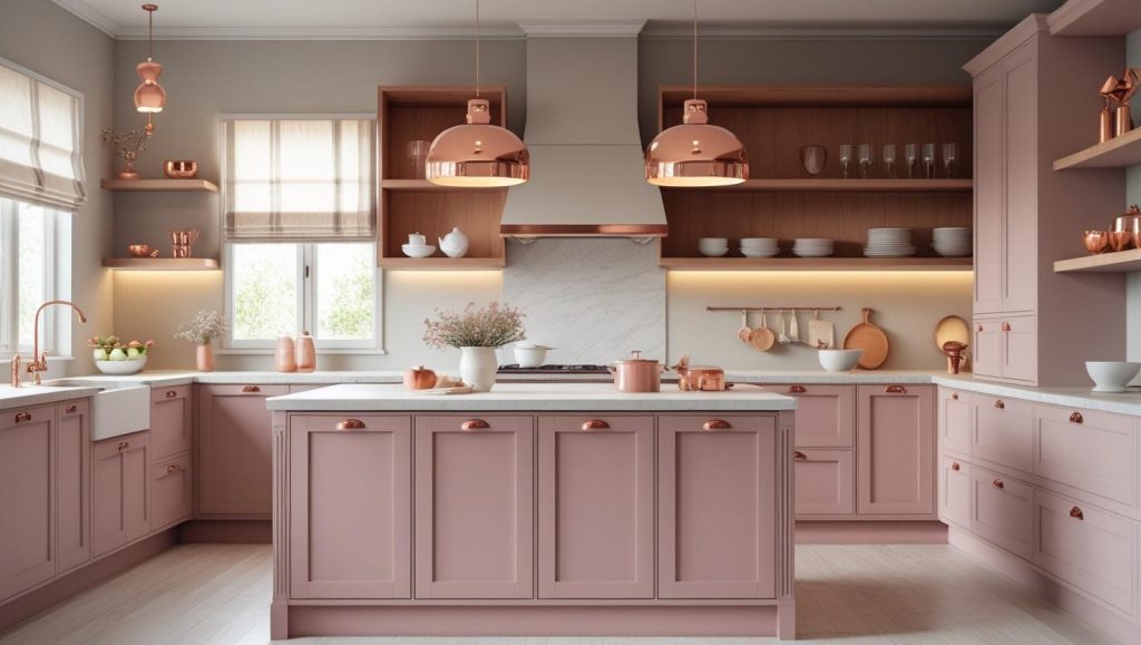
- You should start by grounding the space with dusty rose on your kitchen island or lower cabinets. It is muted and calm, and far from the sweetness of bubblegum pink.
- Light wood like oak or ash works neatly and visually pleasingly for upper units or open shelving. And it softens the color contrast and lets the palette breathe.
- A satin or matte finish on dusty rose keeps it subtle and modern, and lets the texture of the wood have its moment too.
- This palette tends to settle into the space easily. It feels elegant and calm, not overly feminine.
- Let that same tone carry into accessories (dishware, a fabric blind, or soft linens) that gently echo the rose without overdoing it.
- If you want to anchor the look, go for copper or brushed brass hardware. Or, if you’re leaning more contemporary, matte black forms a clean counterbalance.
- Layered lighting, like warm pendants, soft under-cabinet LEDs, helps enhance both tones and gives your kitchen interior that lived-in glow.
- You should consider pairing with a neutral or soft marble countertop. It helps balance the palette and stops the rose from feeling visually heavy.
- This pairing easily fits into multiple design styles. No matter if it leans minimalist, Scandinavian, or something cozier like cottagecore, it adapts gracefully.
9. Soft Coral and Cool Mint Kitchen Color Scheme
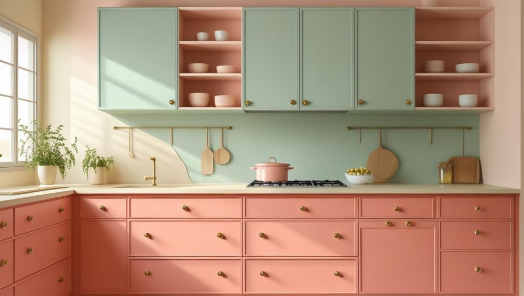
- You must have noticed how a few numbers of colors calm the space. Soft coral is one among them.
- Cool mint, on the other hand, feels like a breeze on a warm day. It settles the palette and pairs effortlessly with coral, primarily if you’re using it on upper cabinets or walls.
- You could use coral on the lower kitchen cabinets to anchor the space gently and let the mint lift the eye upwards. It will keep the whole kitchen light on its feet.
- There’s something quietly charming about this kitchen color combination. It doesn’t seem like begging for attention, and still leaves a lingering impression.
- Try a soft matte finish for both shades because too much shine might flatten their personality.
- If your kitchen gets natural light, both tones tend to shift beautifully through the day. Coral glows at sunrise, mint cools things down by afternoon.
- Rather than competing, a pale countertop in off-white or cream will support the colors quietly and allow them to breathe.
- Muted golds or even frosted glass knobs won’t steal focus. You just need to subtly complete the palette.
- This palette carries a subtle nostalgia, something about it recalls hand-painted kitchen interiors and summer houses, but it fits right into a modern, minimalist setting too.
- If you’re hesitant, start with just the mint on open shelves or in the pantry zone, and see how it settles in your space.
10. Ocean Blue and Sandy Beige Color Scheme
- You’ll find ocean blue a calming base, kitchen island or lower kitchen cabinets, while sandy beige on the uppers or walls softens the overall look.
- You may notice the blue echoes the sea, and the beige mirrors the shoreline. This color combo brings that beachy calm indoors.
- You can consider placing beige where light hits most, like upper cabinets or walls, so the palette stays airy and doesn’t feel heavy.
- You might go for a glossy finish on the blue areas to reflect light, while keeping beige matte to preserve softness.
- You’ll often balance the look with natural materials (driftwood shelves, rattan stools, or teak counters) that echo sandy hues.
- Don’t forget glass or mosaic tiles in blue-beige tones for the backsplash. They can tie the complete kitchen color palette together with texture.
- You may want to choose hardware in brushed nickel or soft brass. They both feel right with cool blue and warm beige.
- If your kitchen has limited natural light, you should consider under-cabinet LEDs to keep both colors bright and balanced.
- You’ll see this pairing is versatile. It works just as well in open-concept layouts as in snug, tucked-away kitchens interiors.
11. Deep Burgundy and Cream Kitchen Color Scheme
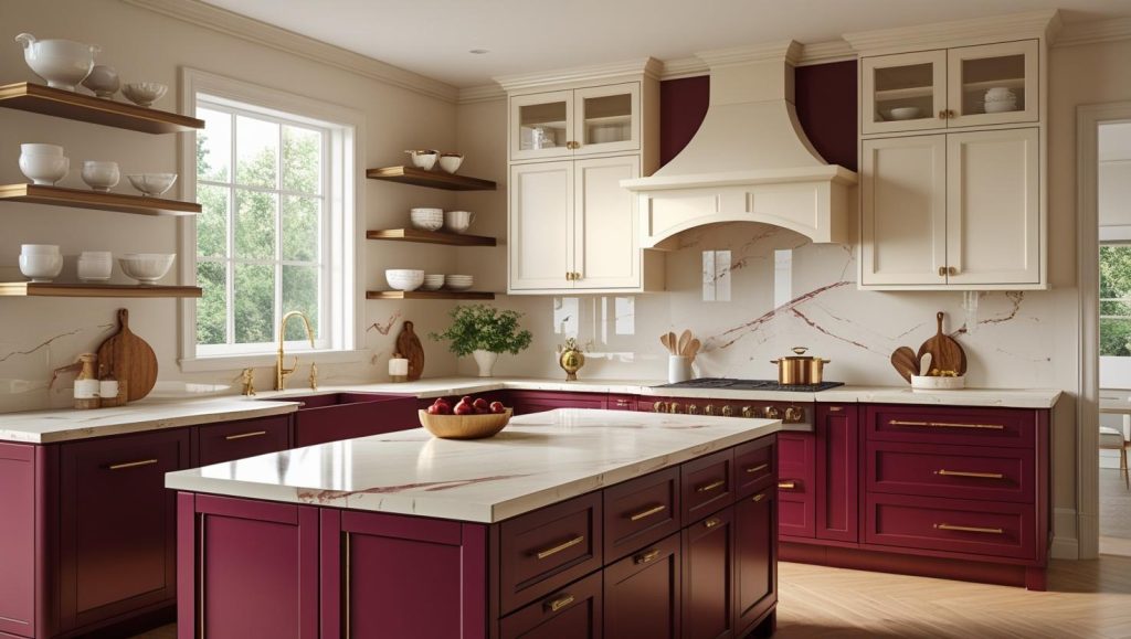
- You’ll see depth and richness by using deep burgundy for lower cabinets or the island. It renders a unique element to avoid overwhelming the space.
- Cream on upper kitchen cabinets or walls balances that depth, adding lightness so the kitchen doesn’t feel closed in.
- You might go for a glossy or satin finish on burgundy. Primarily, if you have good light while keeping the cream matte to maintain softness.
- You could highlight burgundy’s veins by pairing it with cream marble kitchen countertops or a backsplash. It echoes the palette beautifully.
- You’ll tie both tones together subtly by choosing hardware in brushed gold or brushed nickel. It reflects both richness and neutrality.
- You might introduce warmth with wood with framed glass shelves, a butcher-block island top, or natural flooring, to soften the red depth.
- If the burgundy feels too heavy at first, start small, perhaps on a peninsula or lower racks, before committing to full cabinetry.
- You’ll notice lighting matters, natural light brings out burgundy’s red tones, while dim rooms lean toward brown or even black.
12. Purple and Grey Color Scheme for Your Kitchen Interiors
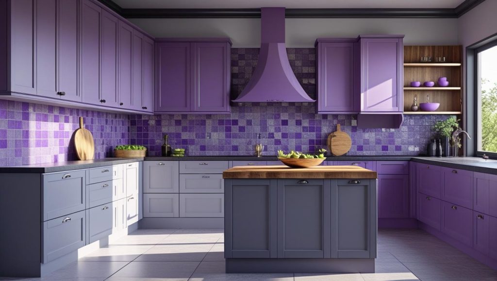
- You can ground the lower cabinets or island with a calm grey, while a muted purple on the uppers brings in a subtle, uplifting contrast.
- You might favour lighter purples, lavender or lilac, for a serene, contemporary look that complements the neutrality of grey.
- If you love drama and boldness, try eggplant or plum below and light grey above. It creates richness without feeling heavy.
- You’ll notice finishes matter: matte grey feels refined, while a satin purple reflects light and softens the mood.
- You can echo the purple-grey mix in a statement backsplash, mosaic tiles mixing both hues.
- You’ll want hardware in brushed nickel, matte black, or muted gold. They bridge both tones harmonizing them with each other.
- You might bring in wood touches (shelving or a butcher-block island top) to soften the cool combo and add tactile warmth.
- Natural light becomes a design tool here. How? It pulls out purple’s blue undertones and keeps grey from looking too cold.
- You could start small, maybe purple open shelving or a breakfast bar. Let the space tell you how much boldness it can take.
- You’ll find this pairing feels both sophisticated and composed, because a modern take on elegance that stands the test of time in bigger or smaller kitchens.
How Can Opalspace Help You?
The right two-tone kitchen color scheme has to do with how you want your space to feel every day. Either you lean toward calming contrasts or striking combinations, the right pairing completely shifts the mood and movement of your kitchen. If you’re still wondering which colour duo suits your space and style best, let Opalspace help you translate ideas into beautiful, functional reality. Because great design starts with a conversation.
Beyond Kitchen interiors and kitchen color schemes, we offer complete interior design services, from modular kitchens and wardrobes to bedroom makeovers, smart storage ideas, and full home renovations. Whatever your space or style, Opalspace is here to make your home more functional, beautiful, and truly yours.
Beyond Kitchen interiors and kitchen color schemes, we offer complete interior design services, from modular kitchens and wardrobes to bedroom makeovers, smart storage ideas, and full home renovations. Whatever your space or style, Opalspace is here to make your home more functional, beautiful, and truly yours.
FAQs
1. What are the main features that define a modern kitchen design?
A modern kitchen design is characterized by its emphasis on clean lines, minimalism, and functionality. You will often see sleek, handle-less cabinets, integrated appliances, and a clutter-free countertop. The use of materials like stainless steel, glass, and engineered stone for countertops is common, all contributing to a streamlined and efficient cooking space that feels both sophisticated and practical.
2. What is the primary advantage of choosing a modular kitchen over a traditional one?
The biggest advantage of a modular kitchen is its customizability and efficiency. Since it is built from pre-made cabinet and storage units, it can be designed to fit any kitchen layout perfectly, maximizing every inch of available space. This approach also typically allows for a faster and more organized installation process compared to traditional, site-built cabinetry, and it offers great flexibility for future updates.
3. I'm planning my kitchen interiors and feel overwhelmed. Where should I start?
A great place to start is by considering the work triangle, which is the path between the sink, the stove, and the refrigerator. Ensuring these three points have an efficient flow is the foundation of a functional kitchen. From there, you can focus on your storage needs, countertop workspace, and the overall aesthetic you want to achieve, whether it's a sleek modern look or a more warm and inviting style.
4. We're adding a kitchen island. What are some key things to keep in mind for it to be truly useful?
A kitchen island can be a fantastic addition, but its usefulness depends on proper planning. First, ensure there is enough clearance around it—at least 42 inches—for comfortable traffic flow. Then, think about its primary function: will it be for food prep, casual dining, or additional storage? This will determine if you need a sink or cooktop, an overhang for bar stools, or cabinets and drawers built into the base.
5. We're deciding on kitchen cabinet color schemes for our new modular kitchen. What are some timeless options?
For a timeless look, you can't go wrong with classic white or off-white cabinets, as they brighten the space and offer incredible versatility for updating your backsplash or hardware later. Two-tone cabinetry, where your upper and lower cabinets are different colors, is also a popular and enduring choice. For a warmer, contemporary feel, shades of grey or navy blue are excellent options that remain stylish without being too trendy.
6. What are some good kitchen color schemes for a smaller kitchen to make it feel larger?
To make a smaller kitchen feel more open and airy, light and monochromatic color schemes are most effective. Using varying shades of the same light color, like soft grey on the cabinets with a white countertop and a similar-toned backsplash, can create a seamless look that visually expands the space. Incorporating a reflective backsplash, like a glossy subway tile, will also help bounce light around the room.
7. Is it better to have kitchen cabinets that go all the way to the ceiling?
Yes, in most cases, opting for cabinets that extend to the ceiling is a wise decision. This design eliminates the dusty, hard-to-reach gap on top of standard cabinets, giving you a cleaner look and more storage space. You can use the upper section for storing items you don't need frequently. If you're concerned about accessibility, a popular solution is to have functional cabinets below and shallower, decorative cabinets on top.
8. We want a warm and inviting modern kitchen. What materials and colors would help achieve that?
You can achieve a warm modern kitchen by balancing sleek elements with natural textures. Consider using wood-toned cabinets in a warm oak or walnut finish for your lower units, paired with a neutral color for the uppers. Incorporate natural materials like a stone-look quartz countertop with subtle veining, and add warmth underfoot with wooden flooring. Finally, strategic under-cabinet lighting can create a soft, inviting glow in the evenings.