This blog is going to cover the list of perfect neutral paint colours for your home that you won’t regret later. Our guide covers the best shades and how to use them in any room.
Table of Contents
You know why neutral paint colours have become the first choice when it comes to colouring your walls around you. Actually, they’re chosen over louder, bolder shades for their persistent versatility in interior design. That’s no wrong that statement colours can anchor a single wall, but neutrals provide a strong backdrop. What it does is that it enhances architectural details, amplifies, natural light, and maintains balance. This way, the furniture, artwork, and personal collections automatically appear to be taking centre stage.
The assumption that neutral paint colours are a simple choice is a common misconception. In reality, the extensive range of whites, greiges, and taupes requires careful consideration. After years of specification, I have narrowed my selection to five failsafe neutral paints that form the foundation of countless successful projects.
What are the best neutral colours?
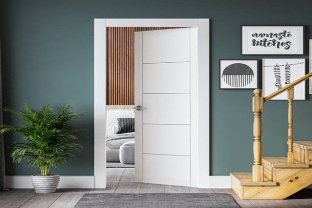
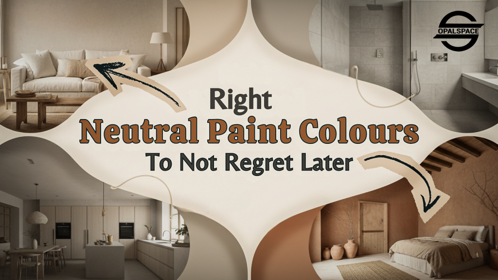
1. Warm Whites & Creams
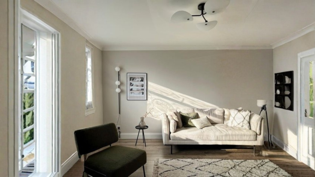
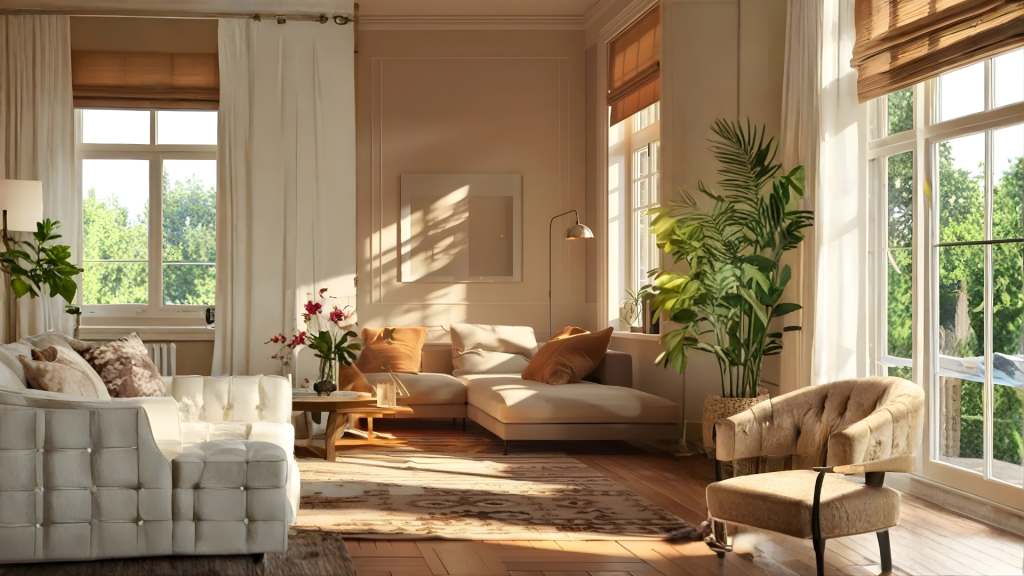
Warm whites and cream colours are your go-to neutral shades now-a-days. These colours carry nuanced hints of yellow, red, or pink, for a soft glow. They’re particularly valuable in north-facing rooms because they don’t get much sunlight. You’ll mostly see them with sharp but clean and rich wood tones in traditional or transitional home decors. Only thing you need to keep in mind is that in a room already full of afternoon sun, these shades can sometimes look a bit too yellow.
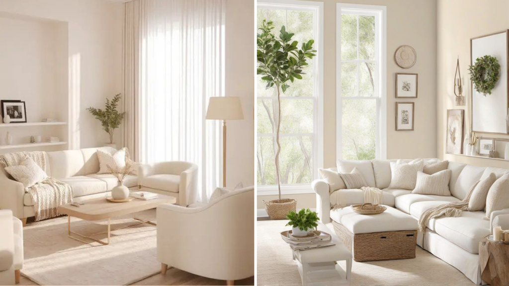
2. Cool Gray & Blues
This shade has earned its reputation as a designer favourite for a clear and practical reason. As experienced designers emphasize, the success of any neutral lies in its undertone. A gray that is too cool can feel overly minimal and uninviting, at the same time as one that is too warm usually lacks luxurious impact. But Repose Gray achieves an ideal equilibrium. This balanced versatility enables it to perform reliably in a wide range of lighting conditions and alongside various materials.
3. The Greige Revolution
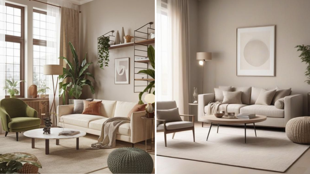
For years, the choice felt limiting. Beige could feel dated or too yellow in certain lights, and cooler grays sometimes left a room feeling harsh. But, here, greige gracefully bridges that gap. It provides a warm base along with the gray component. And this gray component keeps it feeling fresh and modern.
4. Earthy & Organic Neutrals (Taupe, Mushroom, Clay)
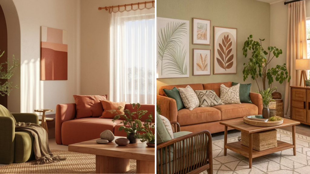
There are earthy and organic neutrals like taupe, mushroom, and clay which are important for designing interiors. They rise above basic neutrals by replicating the natural world in your space. They work beautifully in almost any light. Additionally, they combine easily with natural materials like wood, stone, and linen. And that’s what makes them exceptionally versatile.
How to Combine Neutral Paint Colours Smartly?
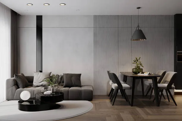
Monochromatic Layers: This technique brings out sophistication through tonal variation. By using different shades of the same colour, you get to develop interest in a room. It results in a pulled-together, layered look.
Warm & Cool Contrast: If you pair warm and cool tones, it gives uniqueness to your interior design. For example, using a warm wall colour beside bright white window frames makes the mouldings look detailed. And so, this contrast provides visual energy.
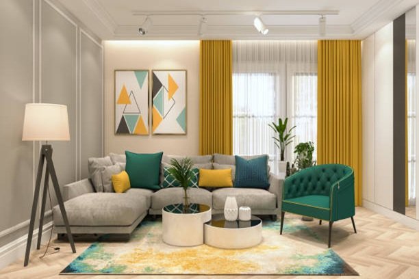
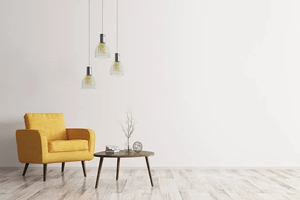
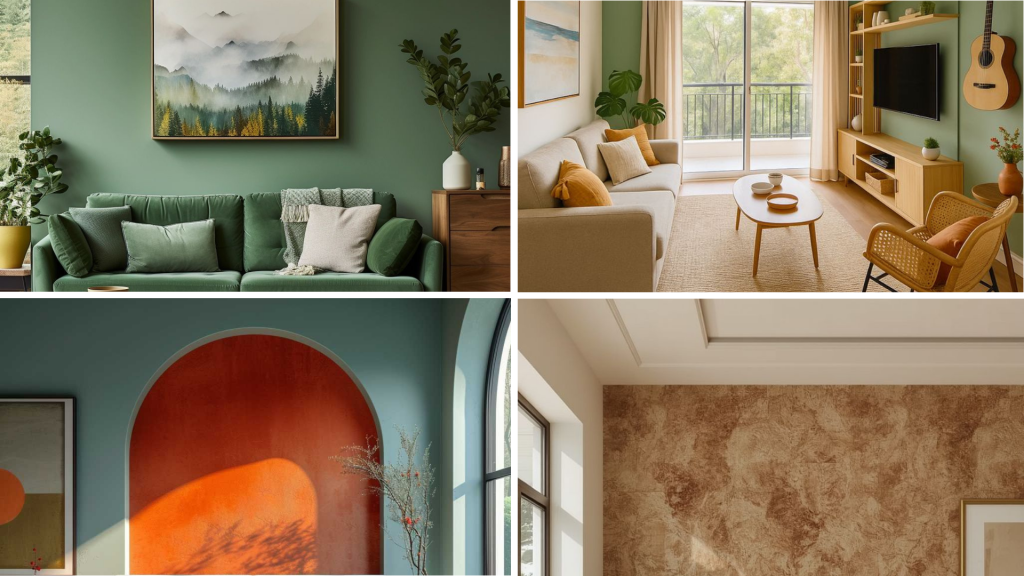
Complementary Accents: When your walls are in neutral colour, you have the opportunity to add in other colours how and where you want them. This approach eliminates monotony.
Texture as Colour: When you use mostly neutral colours, the way things feel becomes very interesting. To form a rich and dimensional feel, it is recommended to put different materials together (like a rough basket, a soft rug, a polished table, and a glossy door frame). This way, your room doesn’t appear boring anymore.
Warm & Cool Contrast: If you pair warm and cool tones, it gives uniqueness to your interior design. For example, using a warm wall colour beside bright white window frames makes the mouldings look detailed. And so, this contrast provides visual energy.
Complementary Accents: When your walls are in neutral colour, you have the opportunity to add in other colours how and where you want them. This approach eliminates monotony.
Texture as Colour: When you use mostly neutral colours, the way things feel becomes very interesting. To form a rich and dimensional feel, it is recommended to put different materials together (like a rough basket, a soft rug, a polished table, and a glossy door frame). This way, your room doesn’t appear boring anymore.
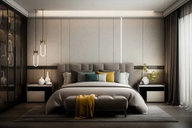
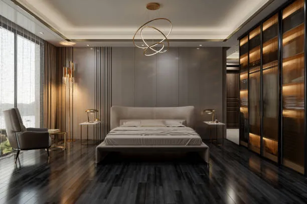
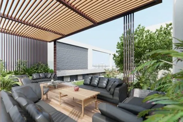
What are the Perfect Neutral Colours for the Living Room?
For North-Facing Rooms (cool light)
Rooms with north-facing windows receive light that tends to be cool and can cast a gray tone. To fix this, you need to select a neutral paint colour that has a subtle warm base to create a warmer atmosphere. Soft greige or a creamy white counteracts the cool light.
For South-Facing Rooms (warm light)
Rooms with south-facing windows receive strong, warm light throughout the day, which can make colours appear more yellow. To achieve a balanced look, you should choose a neutral paint with a slightly cool undertone, such as a light taupe or a pale gray. This prevents the walls from looking overly yellow as the light changes.
For Open-Plan Spaces
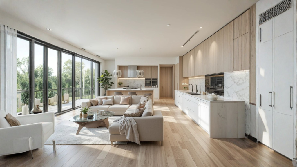
For an open layout, it’s all about consistency. If you use one primary neutral colour throughout the connected walls, it makes the whole area feel larger and harmonious. You can then introduce variety through your furniture, rugs, and decor in each distinct zone.
Impact on Perceived Space
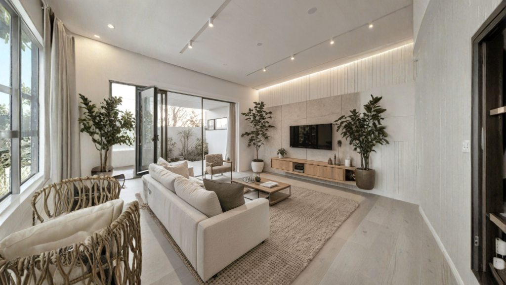
A light neutral shade will open up a smaller living room and make it feel airy. If you have a large space, a slightly deeper neutral can add a sense of intimacy and warmth without closing it in.
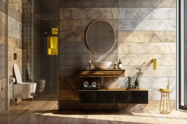
What are the Perfect Neutral Colours for Bathrooms?
Moisture & Finish
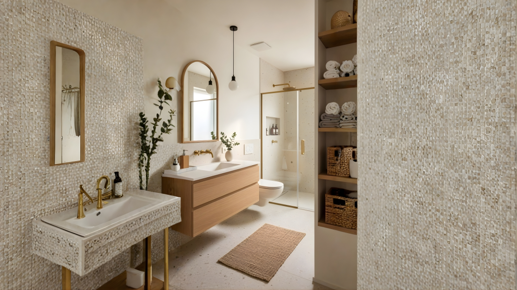
In a bathroom, durability is just as important as colour. And for you to achieve it, you should always choose a paint with a satin or semi-gloss finish. Because it resists moisture and mildew much better than a flat matte.
Lighting Considerations
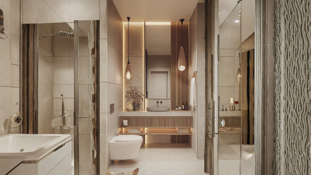
Test your neutral colour swatch under both the artificial lights you use at night and in natural daylight. A colour that looks perfect in a store might appear too cool or green under bright vanity lights, so verification is very important.
Clean & Spa-Like
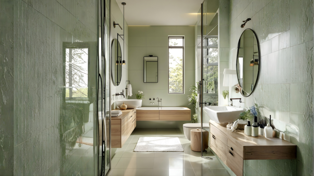
Neutrals like soft greens, pale greys, and warm whites are excellent for promoting a sense of cleanliness and calm. They give you a relaxing backdrop.
Pairing with Fixtures
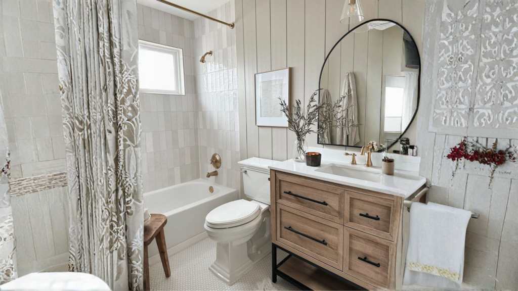
It’s very important that your wall colour should complement your permanent fixtures. Cooler neutrals pair beautifully with chrome and brushed nickel, whereas warmer tones fit best with brass and gold finishes.
How to use Neutral colours?
- Undertones must be Matched: Identify if your fixed elements (floors, countertops) have warm or cool undertones. Then choose a wall colour with a complementary undertone for harmonising the complete appearance.
- Test with LRV in Mind: When sampling, it is recommended to go for colours with a similar Light Reflectance Value (lightness/darkness) but different undertones. This shows you how the undertone alone behaves in your space.
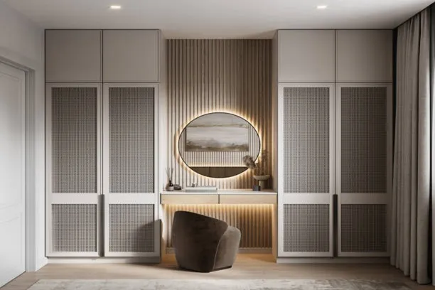
- What about Textures? In a neutral space, you should combine different materials like linen, wood, leather, and metal. They help you induce depth and prevent a flat look.
- Go for 60-30-10 Rule:
- 60%: Your main neutral (e.g., walls).
- 30%: A secondary neutral in a different shade or texture (e.g., furniture, rugs).
- 10%: An accent colour or metallic for visual pops (e.g., pillows, decor).
- Need to Do Something with the Room’s Light: You should use lighter neutrals in small or dark rooms to brighten the space. And in case of sunny rooms, you should be using darker, richer neutrals in large. The reason is simple that colour controls the reflection of light.
- Must be a Visual Connection: If you use a consistent neutral palette in connecting spaces (like hallways), that makes your home feel larger and more put together. Also, make sure to change accents from room to room for variety.
How Can Opalspace Help You?
We’ve explored how the right neutral colours, by understanding undertones and room-specific applications, form the essential foundation of a harmonious home. Our design experts use this precise methodology to select the perfect shades for your space, ensuring a result that is both beautiful and scientifically balanced. Beyond colour consultation, we provide complete interior design services, everything from spatial planning and material selection to final styling, to easily bring your entire vision to life. Let us help you build a home that feels both intentional and effortlessly cohesive.
FAQs
1. What are the most popular neutral paint colours?
The most reliable neutral paint colours are versatile shades that work in various lights. These include warm whites and creams for north-facing rooms, balanced greiges that bridge beige and gray, and earthy taupes. The key is selecting a colour with an undertone that complements your fixed elements and lighting, ensuring it remains timeless.
2. How do I choose neutral colours for walls in my home?
Choosing neutral colours for walls requires evaluating your room’s natural light and existing finishes. Identify whether your floors and countertops have warm or cool undertones, then select a wall colour with a complementary base. Always test large swatches in the actual space, observing them at different times of day.
3. Can you suggest a good neutral colour combination?
A sophisticated neutral colour combination uses tonal layering. For example, use a light greige on walls, a deeper taupe on built-ins or an accent wall, and crisp white on trim. This creates depth and interest while maintaining a cohesive, balanced look throughout the space.
4. What are the top neutral paint colours for a living room?
The best neutral paint colours for a living room depend on its light. For north-facing rooms with cool light, choose a soft greige or creamy white. For south-facing rooms with warm light, a light taupe or pale gray works well to prevent an overly yellow cast. This ensures a welcoming atmosphere.
5. Can I use bold colours with neutral wall colours?
Absolutely. Neutral wall colours provide the perfect calm backdrop for bold accents. You can introduce vibrant colours through artwork, throw pillows, accent chairs, or a single feature wall. This approach allows for flexibility and personality without overwhelming the space.
6. What makes a neutral wall colour evergreen and never out of style?
Timeless neutral wall colours have balanced, subtle undertones that avoid trendy extremes. They act as a versatile backdrop, allowing your furniture and art to stand out. Colours like classic warm whites, true greiges, and organic taupes adapt to changing decor styles and lighting conditions year after year.