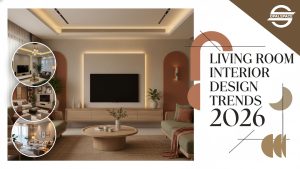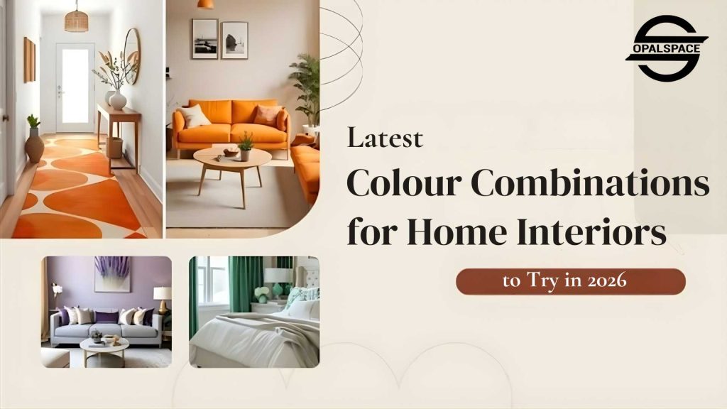
A guide to the latest colour combinations for your home interiors. This blog will answer the question of how to choose a colour palette for your homes.
Table of Contents
‘Colour! What a deep and mysterious language, the language of dreams.’
Somebody Exclaimed
And here I would like to tweak this a bit by adding ‘perception’ and ‘vision’ along with ‘dreams’ – since it’s all about how the brain interprets what the eyes perceive. That’s an undeniable fact. No ifs, ands, or buts. The home colour combination you choose definitely speaks the language of perception, and then comes your vision which gets portrayed in your home.
Sometimes, the walls appear too dull, or sometimes the vibrance of one colour clashes with another, each trying to overpower the other. In my opinion, blindly following a trend just to stay updated can go wrong. No matter what, you choose the fancy and best colour combinations for your home interiors. What truly matters is considering your personality and individuality. It’s always about creating that aura, setting the mood, and making sure your home decor reflects your unique individuality.
Sometimes, the walls appear too dull, or sometimes the vibrance of one colour clashes with another, each trying to overpower the other. In my opinion, blindly following a trend just to stay updated can go wrong. No matter what, you choose the fancy and best colour combinations for your home interiors. What truly matters is considering your personality and individuality. It’s always about creating that aura, setting the mood, and making sure your home decor reflects your unique individuality.
What Are the Best Colour Combinations for Home Interiors?
We’ll help you crack the perfect interior design colour schemes without confusing you with fancy jargon. By the end of this, you’ll know which colour is the best for home interior, color that works best for your home, how to combine them smartly, and how colours affect your mood. Some color pairings never go out of style. They are like salt and pepper. Let’s jump right in!
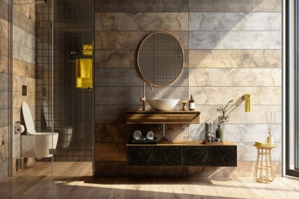
1. Wall Colour Combination with Sage Green
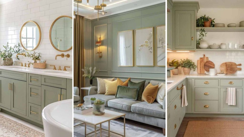
- This colour, when paired with deep blue, brings in calmness.
- It’s perfect for bedrooms or reading corners.
- This shade of green pairs well with wooden furniture and white decor accents.
- When blended with crisp/off-white, it sets the tone of sophistication.
2. Wall Colour Combination with Black
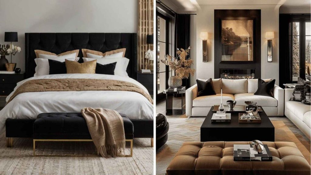
- Black can be overpowering, so balancing it with warm tones like beige or cream maintains the harmony.
- For contract or accent, pairing black with gold or metallics promises your space of sophistication.
- Works well with brass decor, warm lighting, and natural fabrics.
- You can add richness and touch luxury by using velvet, silk, or suede textiles.
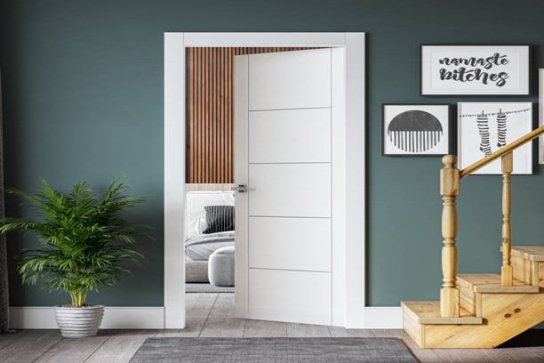
3. Wall Colour Combination with Navy
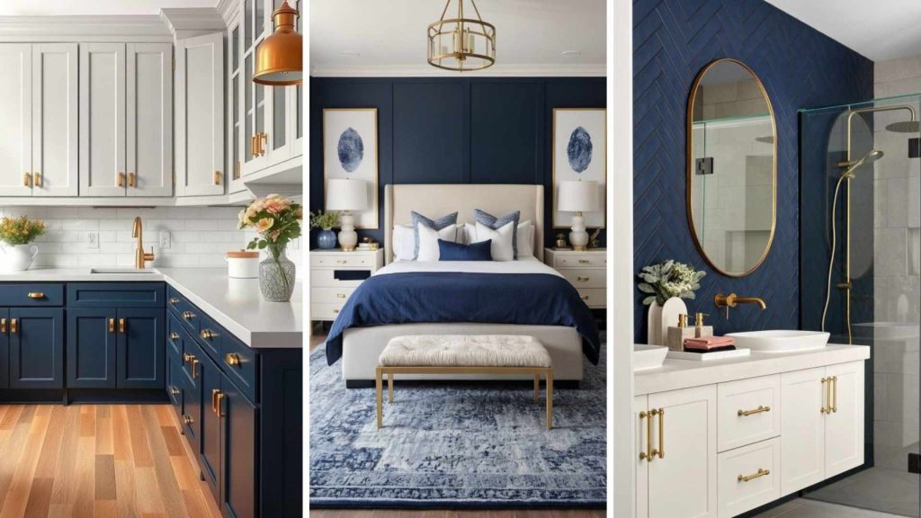
- You can easily pair this colour with neutrals like cool grey or white or beige to create a timeless classy look.
- Contrast it with wooden accessories or fancy furniture pieces as it complements navy beautifully, making spaces feel cozy yet elegant.
- If planning for an accent wall, the navy works well. Especially in bedrooms or living areas with white trims.
- It will give a jewel-tone effect when paired with mustard, which ultimately offers a dramatic touch.
- Navy goes very well with Art Deco – stripes, florals, or geometric prints in white, gold, or soft pastels add depth and break monotony.
4. Wall Colour Combination with Soft Red
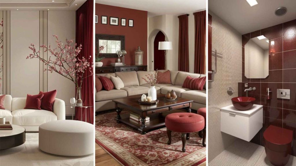
- Oatmeal and khaki with soft red is the statement combination, while for more drama and ultra-modern portrayal, mix it with indigo or cerulean blue.
- Inspired by nature, terracotta, warm browns, and muted oranges enhance soft red’s coziness.
- Matte soft red gives a subtle, polished look, while glossy versions add a modern edge.
- Feel free to add minimalist patterns in upholstery or wallpaper (florals, geometric designs).
- Undoubtedly, warm lighting will enhance the richness of the concerned colour.
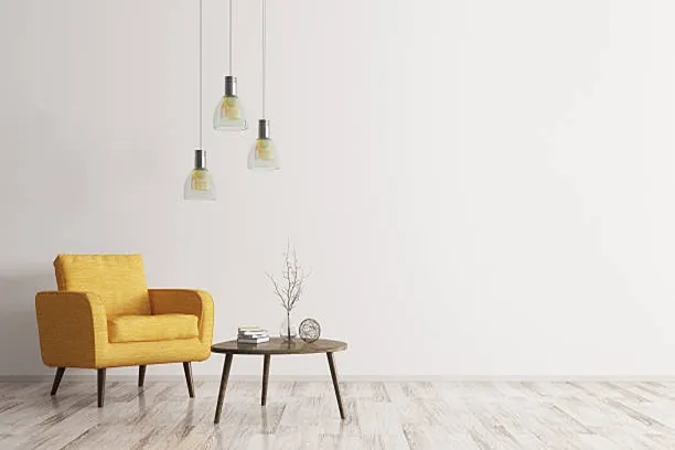
5. Wall Colour Combination with Mustard Yellow
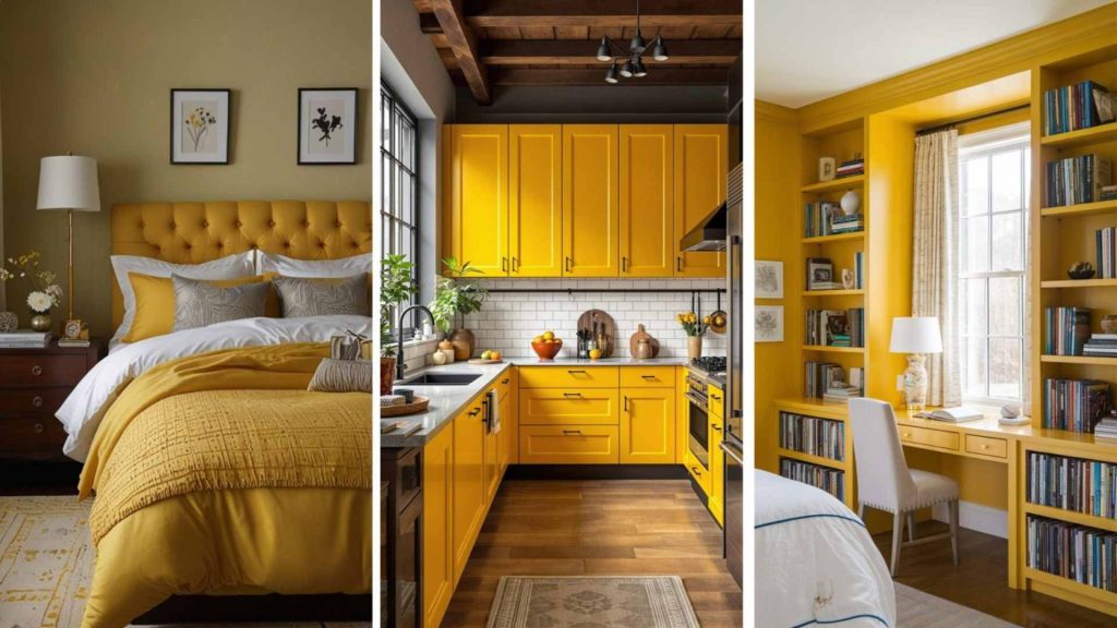
- Warm whites and wooden furniture with mustard serve a minimalistic vintage look.
- Grey has another beautiful impact with mustard – it brings some fun and unique energy with itself.
- If you are a person who loves being surrounded by dramatic colors, then a mix of mustard and bold blue is your pick. It’s great for kitchens, hallways, and kids’ rooms. This combo brightens up any space, making it feel lively and energetic.
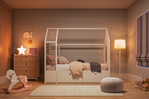
6. Wall Colour Combination with Lilac and Lavender
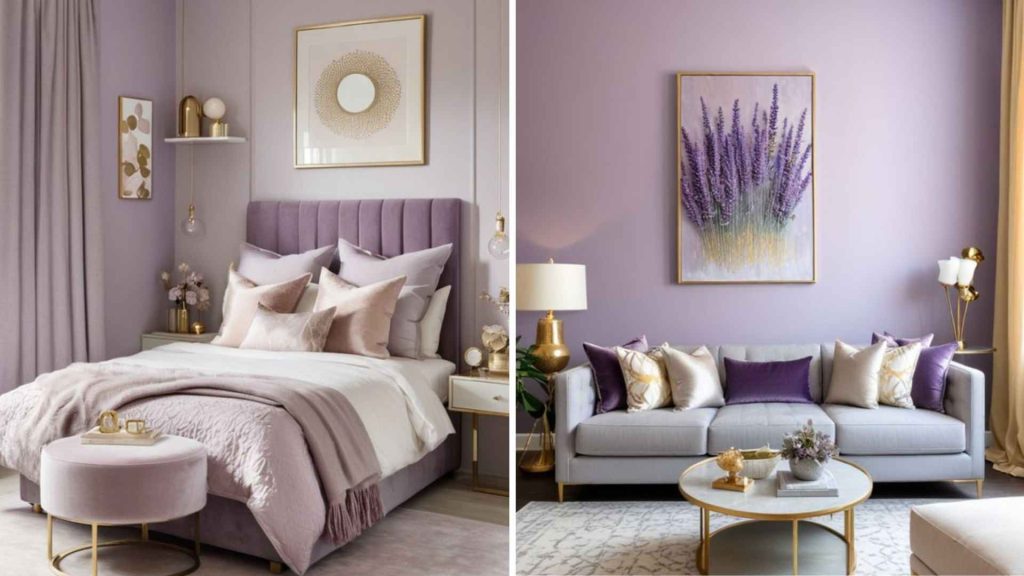
- The soft yet adorable combination is of lilac and baby/powder blue. It’s ideal for a kids’ room, closets and accent walls.
- Soft greys anyways add a bit of a formal touch. However, when paired with lilac or lavender it gets infused with a homely vibe.
- White or soft beige are the best choices for a balancing look with the concerned palettes.
- Deep plum or navy blue add sophistication and depth to lavender/lilac interiors.
- I believe lilac suits minimal, Scandinavian spaces, while lavender pairs beautifully with luxe, Parisian-inspired decor.
These colours make the most sense in bedrooms, living rooms, or spa-like bathrooms due to their calming effect.
7. Wall Colour Combination with Rust Orange
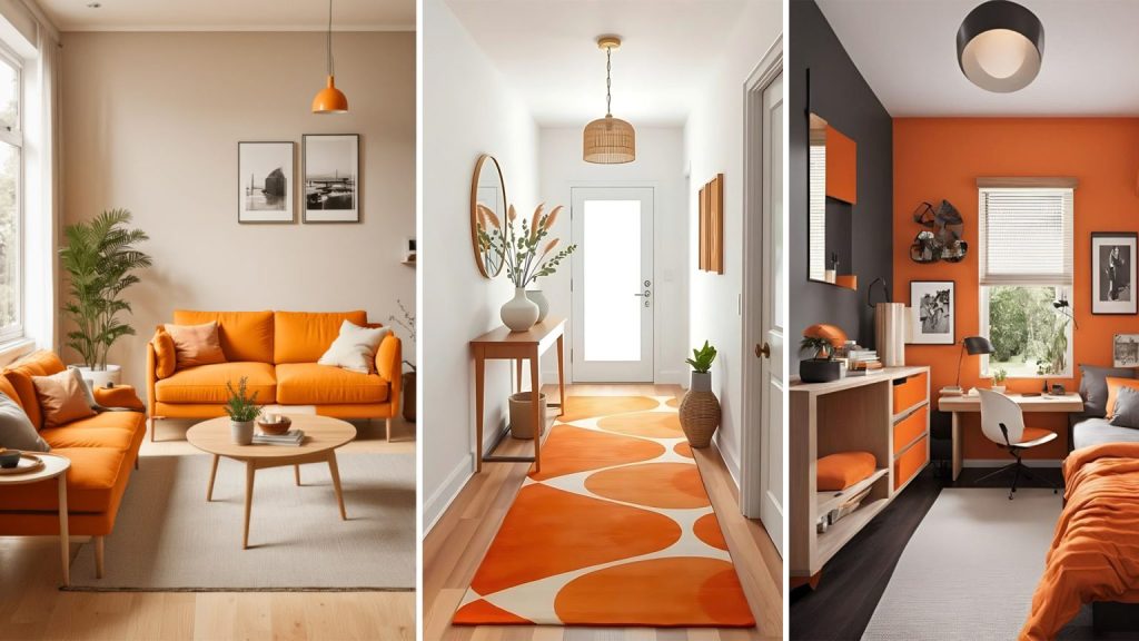
- Rust orange fits best beautifully in boho interiors with layered textiles, woven accents, and global-inspired prints.
- It, undoubtedly, goes well with mid-century modular furniture, warm wood tones, and geometric patterns.
- Why not combine rust with sandy beiges, sage green, and muted turquoise for a relaxed, earthy feel!
- Warm, dimmable lighting enhances rust’s richness, making spaces feel inviting and intimate.
- For a vintage aesthetic feel, amalgamating dirty white or dark shades of beige with the concerned colour will do justice to your desired look.
8. Wall Colour Combination with Oatmeal
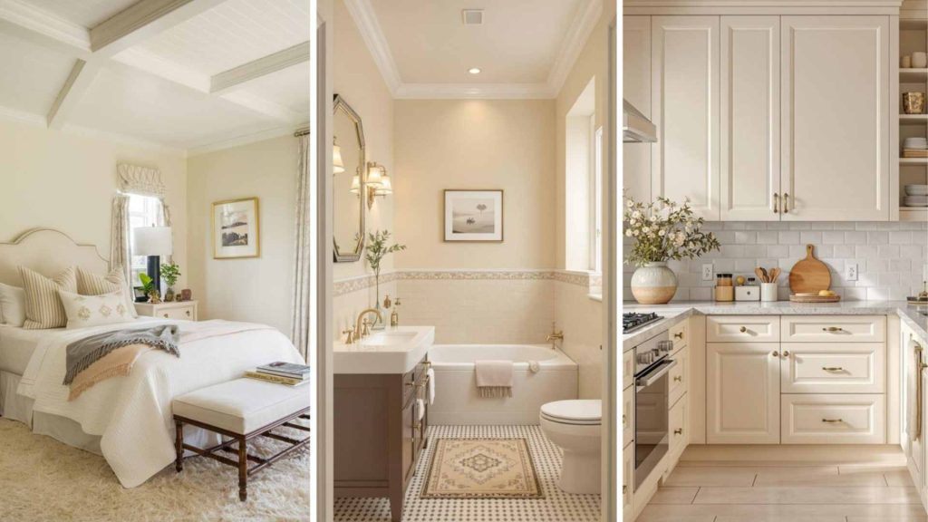
- You can use cream as the base wall colour and create a soft, airy ambiance. Moreover, you can add an oatmeal accent wall or textured wallpaper to introduce warmth and depth.
- If you choose watery blue as a base color or accent wall colour, then opt for oatmeal-colored sofas or linen chairs for an inviting feel.
- A cream or oatmeal vintage rug with hints of watery blue will exceptionally anchor the space.
- Other Complementary Colours:
Muted terracotta – adds warmth and contrast.
Pewter gray – for a modern, refined touch.
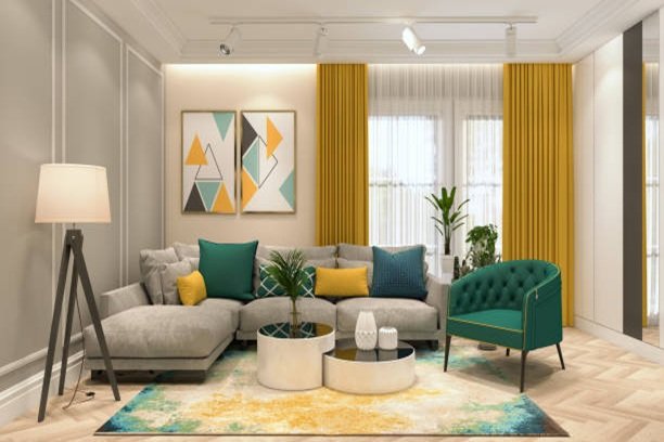
9. Wall Colour Combination with Emerald
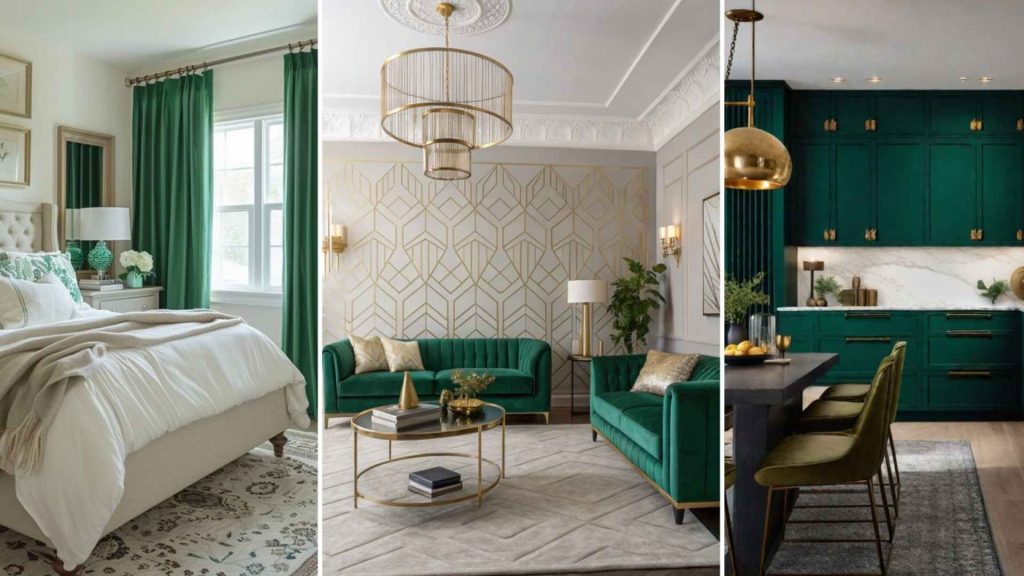
- If you are someone who is looking for the combo of liveliness and sophistication, then emerald is a colour that will not go wrong.
- If you’ve decided to go with a softer look, then I would suggest you pair the concerned colour with white or cream walls, and introduce the color through furniture and decor.
- In fact, using emerald green wall paneling or wallpaper with gold detailing enhances a vintage or luxury look.
- Dark wooden or black lacquered furniture pairs beautifully with emerald.
- Light wood or marble flooring contrasts well with emerald for a modern interior look.
10. Wall Colour Combination with Pinks and Greys
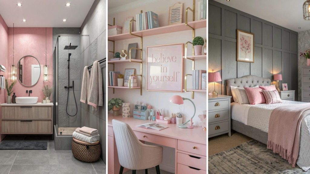
- Using soft grey as the base all colour for a neutral and polished backdrop.
- Blush pink or dusty rose accent walls add warmth and charm.
- Grey sofas with pink cushions create an evergreen and balanced colour energy.
- For a high-end approach, use metallic rose gold accents or marble-effect pink wall panels.
- Curved furniture pieces (sofas, ottomans for a modern yet elegant look.
- A dramatic chandelier with pink glass elements or a Murano glass statement light.
The 60-30-10 Colour Combination Rule for Perfect Balance
The 60-30-10 rule is your go-to recipe for interior colour balance:
This takes care of your space and looks harmonious and well-put-together.
- 60% – Base Colour (Walls & Largest Surfaces)
- 30% – Secondary Colour (Furniture, Upholstery)
- 10% – Accent Colour (Cushions, Decor Items)
This takes care of your space and looks harmonious and well-put-together.
What Are the Common Colour Mistakes to Avoid?
The wrong colours when mixed together can mess up a room’s atmosphere. Here’s what NOT to do:
- Using Too Many Bold Colours Together – Start small, like an accent wall or decor pieces.
- Ignoring Natural Light – Some colours look amazing in sunlight but dull in artificial light. Test them first!
- Overloading Dark Shades – Dark colours can make rooms look smaller if not balanced with lighter tones.
How Can Opalspace Help You?
Mind you, if it’s too light, then it’s bland, and if too bold, then it’s overpowering. Do you also wonder:
What are the best Neutral Paint Colour combinations?
Which Colour Combinations Are Trending in Kitchens?
What Are the Latest Textured Wall Paint Designs for Living Rooms?
Then, my friend, you’re in the right place. Because Opalspace knows that picking the perfect colours can feel too tricky. That’s why we help homeowners find the best colour combinations for their home interiors. In case of any expert guidance, let’s chat and gel up the uniqueness of your palette with the vision of your home.
FAQs
1. Which color combination is best for a living room?
The best color combination for a living room often includes a balance of neutrals and a few accent shades. Popular and timeless combos include beige and white, grey and soft blue, or cream with olive green. These living room colour combinations create a calm and welcoming vibe while allowing flexibility with decor.
2. What is the most used color for a living room?
Neutral tones like white, beige, and light grey are the most commonly used living room colors. They work well with any style and make the space feel open, clean, and elegant. These shades also act as the perfect backdrop for colorful furniture or décor accents.
3. Which colour is positive for to Vastu Shastra?
According to Vastu Shastra, light shades like white, cream, light yellow, or soothing green are considered positive for the home. These colors bring peace, balance, and good energy into the home. Avoid overly dark or harsh tones, especially in the northeast corner of the room.
4. What color makes room bigger?
Light colors such as soft white, pale grey, beige, or pastel tones can make a living room look bigger and brighter. These colors reflect natural light better, creating the illusion of more space. Pairing light walls with mirrors or glass furniture can enhance the effect even more.
5. Which sofa color is best for living room?
The best sofa color for a living room depends on your overall theme, but timeless options like grey, beige, navy, or olive green work well in most settings. Neutral sofa colors offer versatility and are easier to style with cushions, throws, and rugs. If you want a bold look, deep blue or rust orange can add personality without overwhelming the space.